Creating a Patient-First End-to-End Journey | 2020-2021
iRhythm is a medtech company that specializes in heart monitoring. Their main product, Zio, is a wearable device prescribed by doctors to detect and diagnose irregular heartbeats.
From a patient perspective, users simply need to wear the device for the prescribed timeframe and return it. However, the patient journey includes multiple, optional touchpoints spanning digital and physical that add complexity to the overall experience. Throughout 2020 and 2021, our team reimagined the end-to-end journey and created a cohesive and streamlined patient experience.

My Role
-
Led the UX Strategy for the patient journey
-
Collaborated with Customer Care, Sales, Marketing, IT and CX to understand the business needs
-
Partnered with Product and Engineering to develop multi-year roadmaps across multiple touchpoints
-
Managed a team of UX Researchers and Product Designers that created mobile app, web portal, SMS, email and packaging experiences for 1M patients
Defining The Problem
The patient experience was a neglected and disjointed multi-channel ecosystem. Various departments hired external agencies to create portions of the journey without any consideration for the end-to-end experience. Content across touchpoints provided conflicting information, the look and feel was dated, and the overall journey was more complicated than needed.
Our goals were to:
-
Increase patient satisfaction and engagement
-
Provide cohesive messaging and helpful content
-
Rebrand the end-to-end experience
-
Reduce calls to Customer Care
.png)
Synthesizing What We Already Knew
The first step in our research process was to learn what was already known through existing data. We gleaned insights from Salesforce and Tableau to develop an understanding of why patients were calling Customer Care — with our sights set on reducing friction and call volume.
.jpg)
.jpg)
We also conducted interviews with several employees across various disciplines that interacted with our patients on a daily basis. This allowed us to begin sketching-out the patient journey and pain points.

Speaking with Patients
While the company was founded back in 2008, they hadn't conducted research with actual patients. Over the course of two years, we spoke with 1,000+ users to build our foundational knowledge. We also monitored what patients were saying on social media. We communicated our findings throughout the organization on a regular basis to ensure we all had the same understanding of the user problems that needed to be solved.

Our research team synthesized all findings from patient interviews and data analysis to identify the most common pain points across channels. These insights were key inputs into product roadmaps.
.jpg)
.jpg)
Mapping the Cross-Channel User Journey and Opportunities
Leveraging our research and data analysis, we created detailed journey maps to illustrate the highs and lows of the end-to-end experience with opportunities for improvement. We used these maps to socialize our findings, gain support and funding from executive leadership, and to brainstorm ideas with cross-functional teams.
In partnership with Product and Engineering, we prioritized the parts of the journey we wanted to improve first based on value add and effort. From there, we began to concept new features to address patient needs across four touchpoints: patient app, SMS, packaging and website.
.jpg)
Developing an App Strategy
As we were putting together our strategy, we wanted to understand how patients were finding the app, who was using it, and which features they used most/least to inform our plans. We learned app adoption was low overall, but especially with our mature demographic.

.jpg)

.jpg)

We then put together an inspirational vision for the app making it the center of the user journey, and communicated our strategy throughout the organization to generate excitement and gain alignment.
.jpg)
A key part of our strategy was to serve-up dynamic content based on where the user was in their journey and any actions they may have taken (or needed to take).
.jpg)
We used this strategy to map out content and feature needs in the app.
.jpg)
And created content for a new SMS campaign.
.jpg)
Creating an App Roadmap
With Product and Engineering, we planned out a multi-year roadmap of features to bring the UX vision to life and identified the most important problems we wanted to solve in the first release as well as stretch goals.


We then created very detailed problem statements with rough mocks to communicate our vision to the team for execution.


Designing the Patient App
Our first step in the design process was to brainstorm our core design principles, business goals and success metrics with the team including Engineers, Product Management, Customer Care and others. We revisited these principles throughout design to ensure we stayed on track.
.jpg)

Product Management then turned our vision into epics and user stories. Our Designers created a design system and began working in sprints with Engineers and Researchers to create the features for the first release. Work was in progress when I left the company.


Outcomes
While I didn't get to see the app go live, there were several positive outcomes while I was still at iRhythm:
-
Our foundational research and journey maps were widely used throughout the organization and seen as the "source of truth".
-
The research team was viewed as "the experts" when it came to our patients' needs. Researchers were suddenly brought into product strategy meetings and asked to contribute in big-bet initiatives.
-
Our SMS campaign with streamlined messaging was deployed and resulted in a 5% decrease in customer care calls and a 15% decrease in opt-outs.
-
Our research informed several other initiatives our team worked on (see case study below as an example).
-
We had a process in place to conduct patient research with the tools, incentives and approvals required to glean insights quickly — allowing us to inform and reshape product roadmaps by demonstrating some feature ideas would result in bad outcomes before investing in the build.
The Pandemic & Learning Industrial Design by Fire
iRhythm's business was based around patients receiving their Zio at the doctor's office where medical assistants would apply the device and provide education and instruction.
When the pandemic hit, our customers asked us to send the kits (created specifically for clinicians) directly to patients' homes. The end result over 40% of the devices sent out in the first two months of lockdown were never worn or returned - and the company was losing money.
We were brought in by executive leadership to identify the root cause of the problem and recommend solutions. We conducted rapid quantitative and qualitative UX studies.


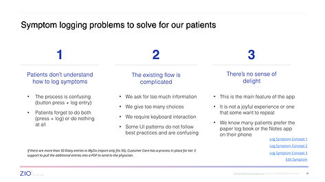
We identified the top three problems we needed to solve.

And recommended new tactics and feature updates across the ecosystem.
.jpg)
Outcomes
Executive Leadership signed off on our recommendations. We designed and deployed all tactics in two months working with dedicated, cross-functional teams resulting in:
-
35% reduction in patient calls to Customer Care
-
50% increase in device returns
We began with a competitive analysis of other medical device kits in market.

We also asked our customers to send pictures of how they store the kits in their office to better understand storage space.
.jpg)
Leveraging our foundational patient research, we completed two rounds of design and tested the kits with real patients. Both kits tested extremely well and resulted in the final kit going to print when I left the company.
Revising the Stop-Gap Packaging Solution
The packaging we created (with no industrial design experience) during the pandemic was an urgent stop-gap solution that had to be turned around quickly to help the company survive. As a team, we knew the packaging needed a significant overhaul. We partnered with our teammates in Manufacturing, Finance, Engineering, Supply Chain and Sales to understand the business requirements, constraints, and garner support for new packaging.
Leveraging our foundational patient research, we completed two rounds of design and tested the kits with real patients. Both kits tested extremely well and resulted in the final kit going to print when I left the company.
.jpg)